Iron Valley Agronomy
Logo & Brand Identity
Logo and brand identity for an agronomy brand, a single emblem that fuses iron and harvest, resolved across a full, agriculture-honest colour system.
01 · The Challenge
One mark for both halves of the name.
An agronomy brand called Iron Valley needs a mark that carries both sides of it, the strength of iron and the life of the harvest, in a single, honest emblem.
02 · The Approach
Hammer meets harvest.
One emblem fuses a hammer with a wheat stalk and leaves, in a palette pulled straight from the field, grain gold and crop green, then resolved across a full set of colour variations so the brand holds together everywhere.
03 · What we did
A colour system for every surface.
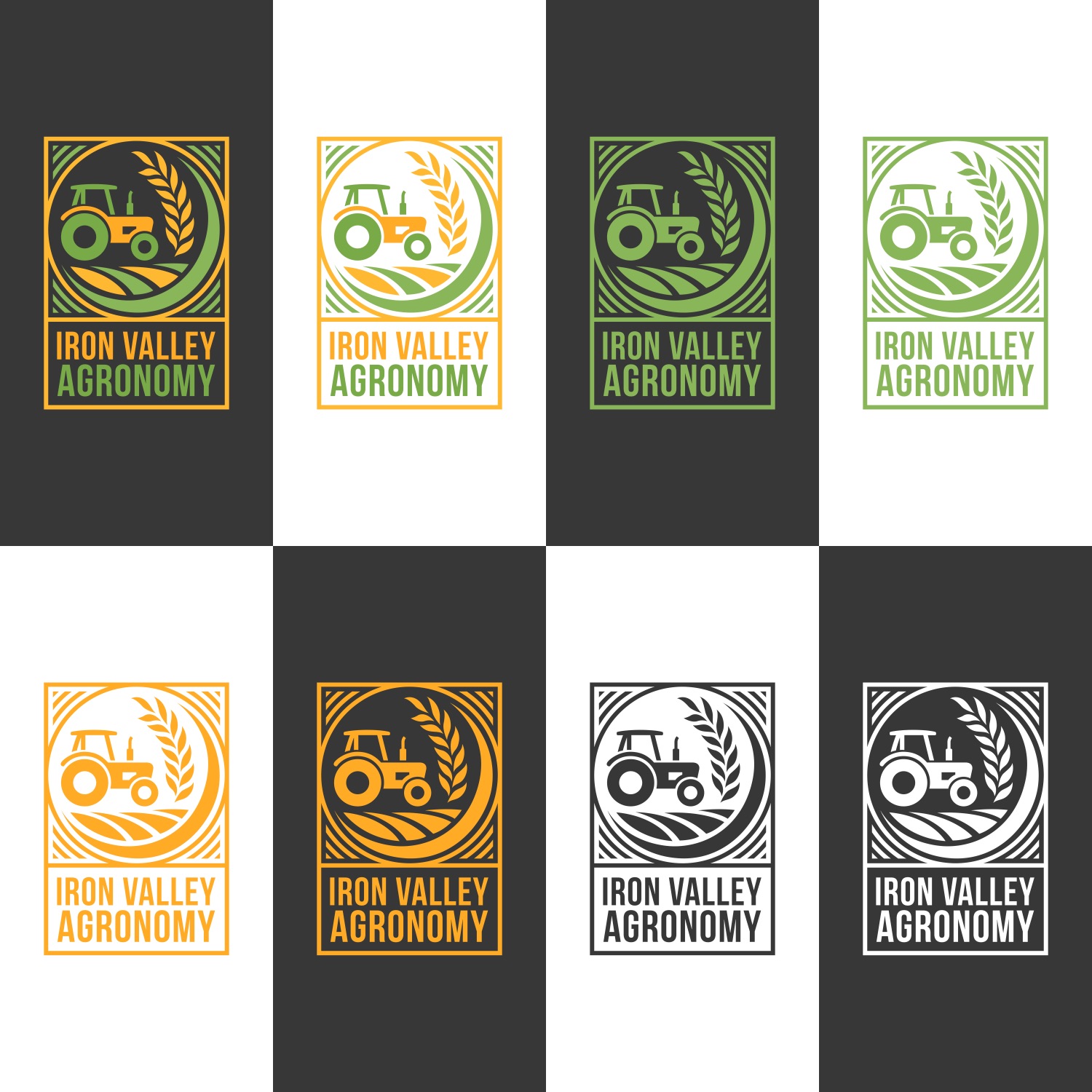
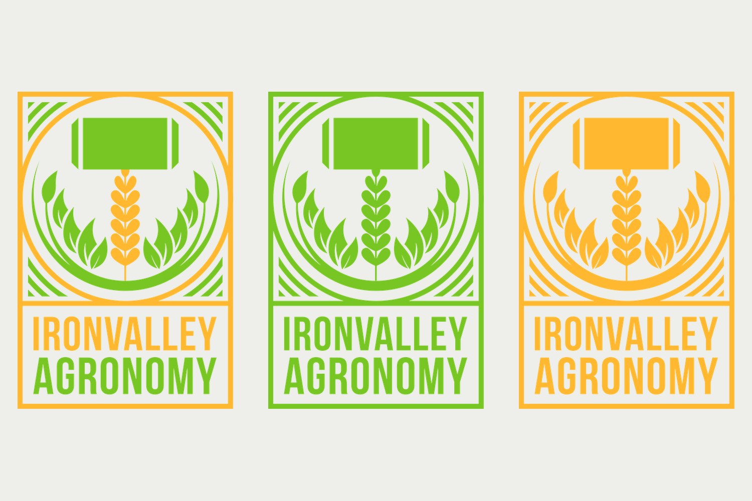
Full-colour, single-colour (green, gold, black) and reversed (white) variations, so the mark stays legible on any background, from a seed sack to a signboard.
- Logo & Emblem
- Wordmark
- Colour System
- Logo Variations
Keep going
All projects →